Project proposal
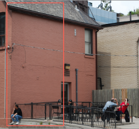
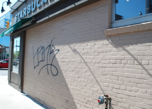
The selected walls are located at Yonge and Davisville on the N-E corner(Toronto,On,Ca). The wall owner is Starbucks coffee. I was introduced to this wall due to proximity (I live in the neighbourhood), but my interest in the wall was due to other elements. The size of the primary wall is approximately six meters tall, and three meters wide facing east, the secondary wall is approximately four meters wide and 2.5 meters tall and is facing south. The surface on both walls is brown/beige painted brick, thus irregular and textured. My approach is to use wood panels painted and installed. The choice of using wood panels is due to the specific requirements of my project ( great detail, and creating a successful illusion of space extension). After close inspection, the state of the wall is good, no damage no water/heat damage, powerful direct morning sunlight and exposure to weather and salt during winter were issues taken into account when developing the project.
The primary mural was developed in order for clients to have a better experience in the outside seating area, eliminate the certain small, back alley, and improvised feeling. The secondary wall was developed in order to complement and support the primary, while also trying to avoid and eliminate, current and future vandalism.
This mural is intended, not only to capture interest of new customers, the passing viewer, contribute to the brand’s status as encouraging/supporting art, but most importantly to maintain the interest and respect of present mid/high class customers. As a result, the absence of the composition i’m proposing, would perpetuate the anonymity and the perceived pettiness of it’s current state. What inspired me to propose that this surface should be developed (painted), is the simple fact that even though it is a small outside area, it is a fairly large, one story venue, and such an artistic presence would be complementary, would raise it’s status and the community’s awareness, thus in the best interest of the business.
The theme that was chosen is that of a street perspective with historical buildings (imaginary) and several individuals having coffee/tea outside in a sunny summer morning (inspired by mid 1900s Seattle fashion, when Starbucks was founded), other elements are fresh flowers, architectural details, jazz musicians, diverse crowd, and historical atmosphere. The main focus is on the side view, of a woman in the foreground smiling, sipping from a cup of tea/coffee and talking to two other individuals. The imagery I chose was driven by the need for this small outside area to have the illusion of grater space, bring importance, grab attention, and inspire. The imagery is rendered is a realistic manner, slightly larger than natural size (for impact and monumentality). The desired pleasant impact on the customer is not only due to relaxing summer colours, beautiful scenery, and nature, but also due to the shift in the space’s meaning, historical feeling and how it relates to all the other buildings. It presents a relaxing scene that would change the grey industrial atmosphere for the customer, community, and is also not contrasting in relation with the other businesses and institutions that surround the venue (flower shop, youth clothes, school, pharmacy) and would show superiority to the coffee house competition across the street.
This project will greatly contribute to the community by showing interest, and respect for the area, trying to make it a pleasant experience for everyone, and investing not only for the business’ benefit, but given the imagery chosen, anyone can enjoy seeing this mural without perceiving it as advertising or a marketing technique, and appreciate its elements.


